Top all-time · #9655

Andrew Denty
Personal blog · andrewdenty.com/blogdesign
Andrew Denty's personal blog at andrewdenty.com covers design. Since 2020, 8 different Hacker News readers have linked it 9 times, most often “A visual comparison of macOS Catalina and Big Sur”. It is still writing: the last post was on 2026-03-19, and you can follow it by feed.
Too few sampled comments (5) to say how often HN recommends it.?
Why HN links it
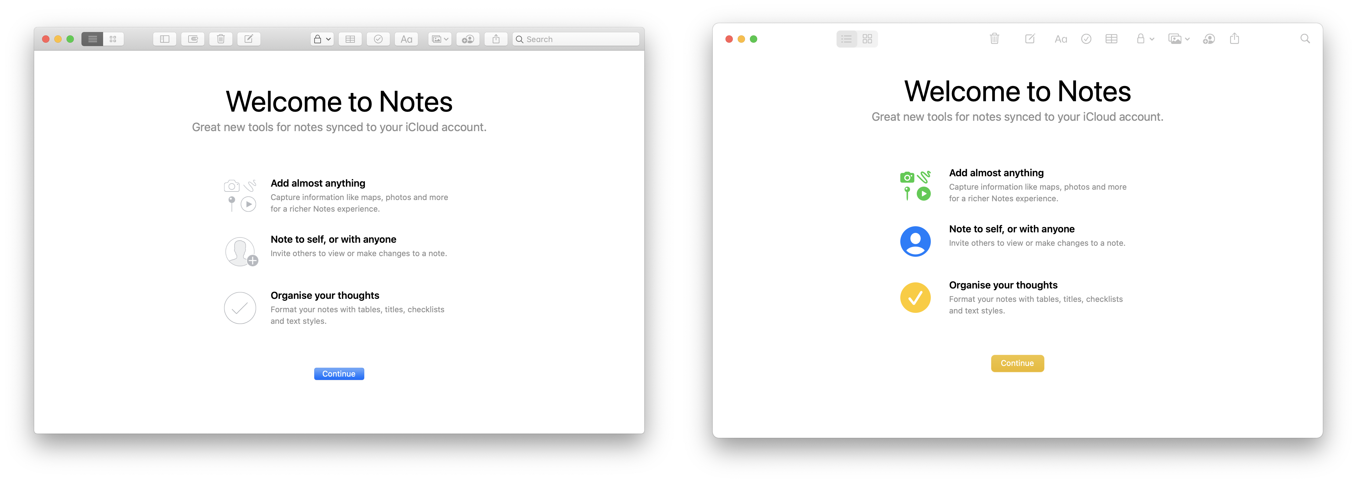
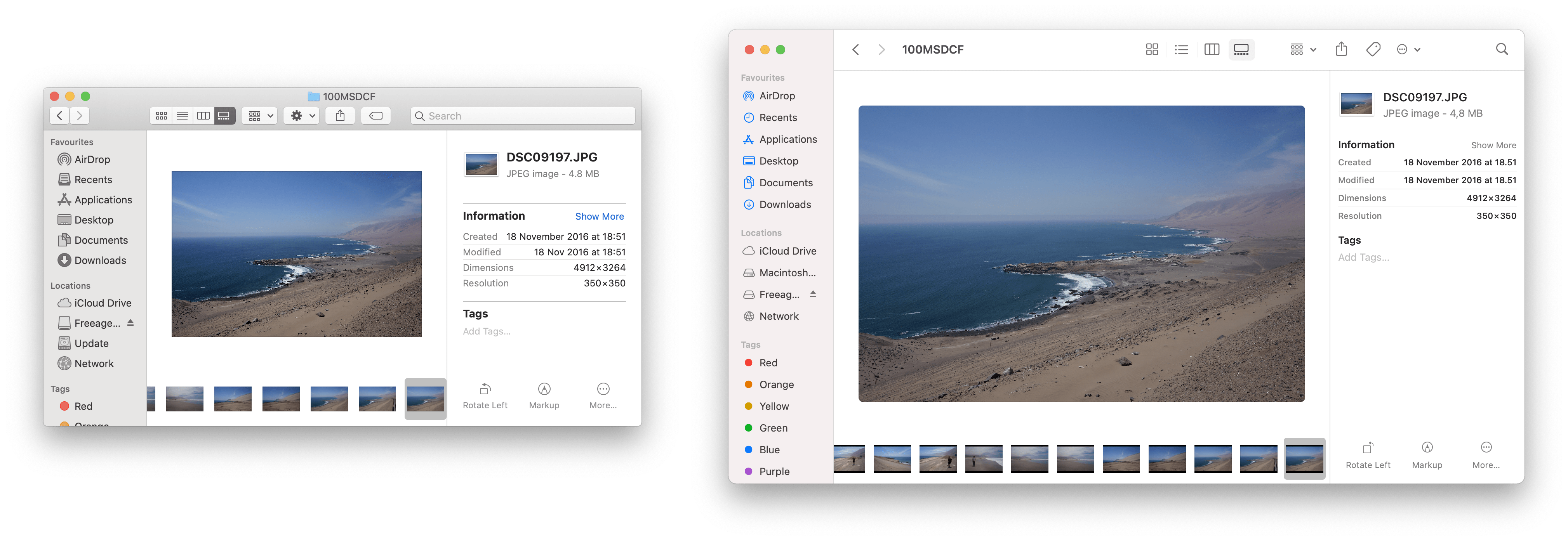
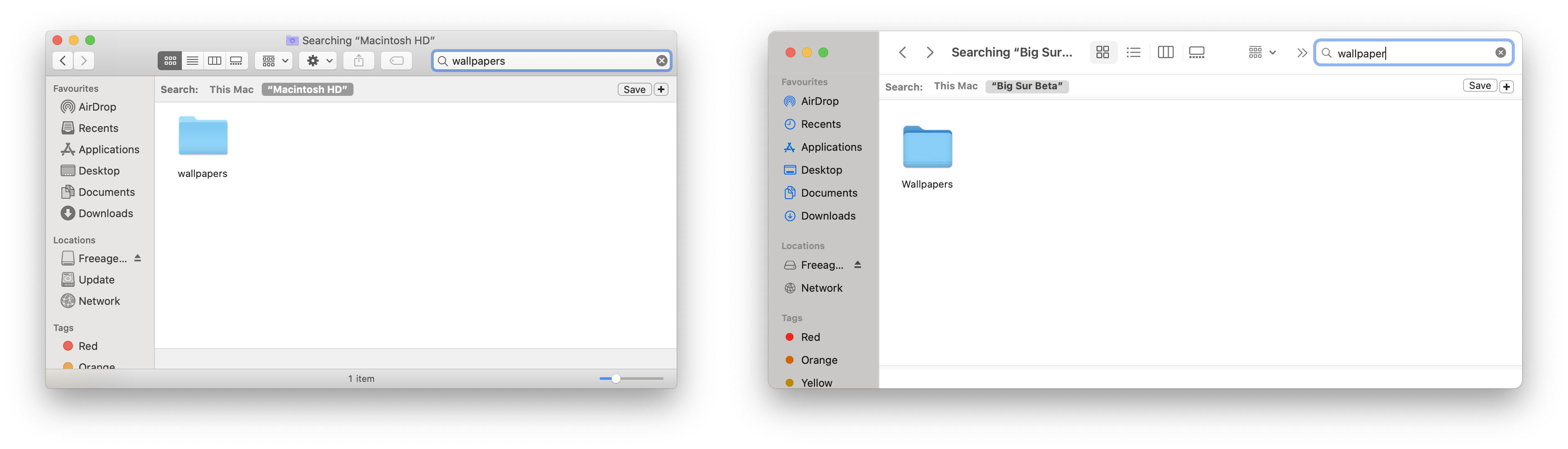
Commenters discuss the author's visual comparison of macOS Catalina and Big Sur, mainly the interface changes to search, keyboard shortcuts, buttons and window title bars.
Summarised by Claude from a sample of 5 HN comments that link here. Each comment is marked recommending, critical or neutral (citing without judging); how this works.
I’m Andrew Denty, Director of Design at ShopMy, based in Copenhagen. A selection of product design work and writing.
Most-linked posts?
- A visual comparison of macOS Catalina and Big Sur3 people · 3 mentions · first linked 2020-07-06
- /blog/assets/img/macos-new-ui/notes/0-notes-first-launch-macos-catalina-big-sur-comparison.png2 people · 2 mentions · first linked 2020-11-14
What Hacker News says?
It is very serious. I love the way Catalina and Mojave looks; dark mode or light mode, it just screams "professional" at the top of it's lungs. Big Sur is, somehow, the exact opposite. Corners are rounded off as if they could hurt someone, and margins are padded more than a cell in solitary confinement. Space is wasted everywhere. It's Fischer-Price design philosophy and I'm hardly the only one to point it out. In a…
Comment linking /blog/assets/img/macos-new-ui/finder/2-finder-gallery-view-macos-catalina-big-sur-comparison.png
on “No I don't want to turn on Windows Backup with One Drive”Submitted A visual comparison of macOS Catalina and Big Sur as a story · 104 points
HN discussionYes but those shortcuts are inconsistent. Cmd 1 does not bring back Messages for example. I have to press tab several times in Mail to figure out where I am in Big Sur where in Catalina the selection is always highlighted. You can’t use the keyboard to change mailboxes in Big Sur as far as I can tell. There’s no clear “language” to the shortcuts. You’d have more usable space with Catalina on that 13” screen. It was…
Comment linking /blog/2020/07/01/a-visual-comparison-of-macos-catalina-and-big-sur.html
on “Intel Problems”Submitted A Visual Comparison of macOS Catalina and Big Sur as a story · 4 points
HN discussionTo add to that, before I had a comfortably sized, well delimited, search bar to click and start typing on Notes. Now it's just a small flat gray icon: https://www.andrewdenty.com/blog/assets/img/macos-new-ui/not...
Comment linking /blog/assets/img/macos-new-ui/notes/0-notes-first-launch-macos-catalina-big-sur-comparison.png
on “A visual comparison of macOS Catalina and Big Sur”Submitted macOS Big Sur is flatter than ever as a story · 2 points
HN discussionDid you mean this example? https://www.andrewdenty.com/blog/assets/img/macos-new-ui/not... The actions bar redesign looks good to me. It's obvious they're buttons to me. It looks cleaner, more modern and less cluttered than before to me. Having the buttons not draw your eye too much can be good if they're rarely used because your focus is drawn to more important parts of the UI. Not keen on the poor contrast white o…
Comment linking /blog/assets/img/macos-new-ui/notes/0-notes-first-launch-macos-catalina-big-sur-comparison.png
on “A visual comparison of macOS Catalina and Big Sur”Something about the spacing and colours kind of reminds me of KDE Plasma. For example the first comparison of the about box [1]. The use of white for the titlebar looks jarring against a grey window background, almost like it's a mistake. The different shades make it still look layered in the Z direction but I can't decide whether the titlebar is in front or behind the window contents and it's kind of uncomfortable?…
Comment linking /blog/assets/img/macos-new-ui/finder/4-finder-search-macos-catalina-big-sur-comparison.png
on “A visual comparison of macOS Catalina and Big Sur”