Top all-time · #14099

designworkplan
Company blog · designworkplan.comdesign
designworkplan is the company blog at designworkplan.com, writing about design. Since 2008, 5 different Hacker News readers have linked it 8 times. The last post was in 2023, but the archive is still widely read.
Too few sampled comments (2) to say how often HN recommends it.?
Why HN links it
designworkplan is a design blog covering typography and fonts. HN comments link its posts on typefaces such as Arial, Helvetica and the Dutch government font when discussing font design.
Summarised by Claude from a sample of 2 HN comments that link here. Each comment is marked recommending, critical or neutral (citing without judging); how this works.
We help businesses make their environments easy to navigate places for people.
What Hacker News says?
Does this font feel Canadian to Canadians? The Dutch government also has its 'own' typeface [1,2], used on everything from the official weather reports to tax forms and road signs. Dutch people recognize anything written in it as something meant to be taken seriously. [1] https://www.rijkshuisstijl.nl/bouwstenen/lettertype [2] http://designworkplan.com/typography-fonts/rijksoverheid-san...
Comment linking /typography-fonts/rijksoverheid-sans-serif.htm
on “Canada 150 Typeface”Submitted Dutch government introduces a custom typeface: Rijksoverheid as a story · 22 points
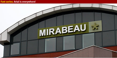
HN discussionThe "R", "r", and "t" characters are the way you can tell between the two fonts. I think an example of a bad logo is Arial is this one: https://www.designworkplan.com/wp-content/font-arial-everywh... The A has too much space around it and it looks "uneven". The bottom one of this one is Helvetica. https://cdn0.tnwcdn.com/wp-content/blogs.dir/1/files/2009/10... It looks "fuller", "denser" to me. And leaves me with an…
Comment linking /wp-content/font-arial-everywhere-005.jpg
on “Carmack Leaves Meta”Submitted Outstanding examples of architectural signage as a story · 2 points
HN discussionSubmitted Design, branding & visual communication? Identity 2.0 as a story · 2 points
HN discussionSubmitted Free Symbol Signs as a story · 1 points
HN discussionSubmitted Font Series: Arial is everywhere as a story · 1 points
HN discussionSubmitted Beautiful and inspiring Designers Quotes as a story · 1 points
HN discussion